
Can Everyone Read Your Website? How Color Contrast Can Make or Break Your Design
Have you ever visited a website and struggled to read the text because the colors seemed to blend? That’s a color contrast problem! And it can make or break a website’s readability and accessibility. Whether you’re designing a blog, presentation, or marketing, understanding color contrast is one of the most important design basics to master.
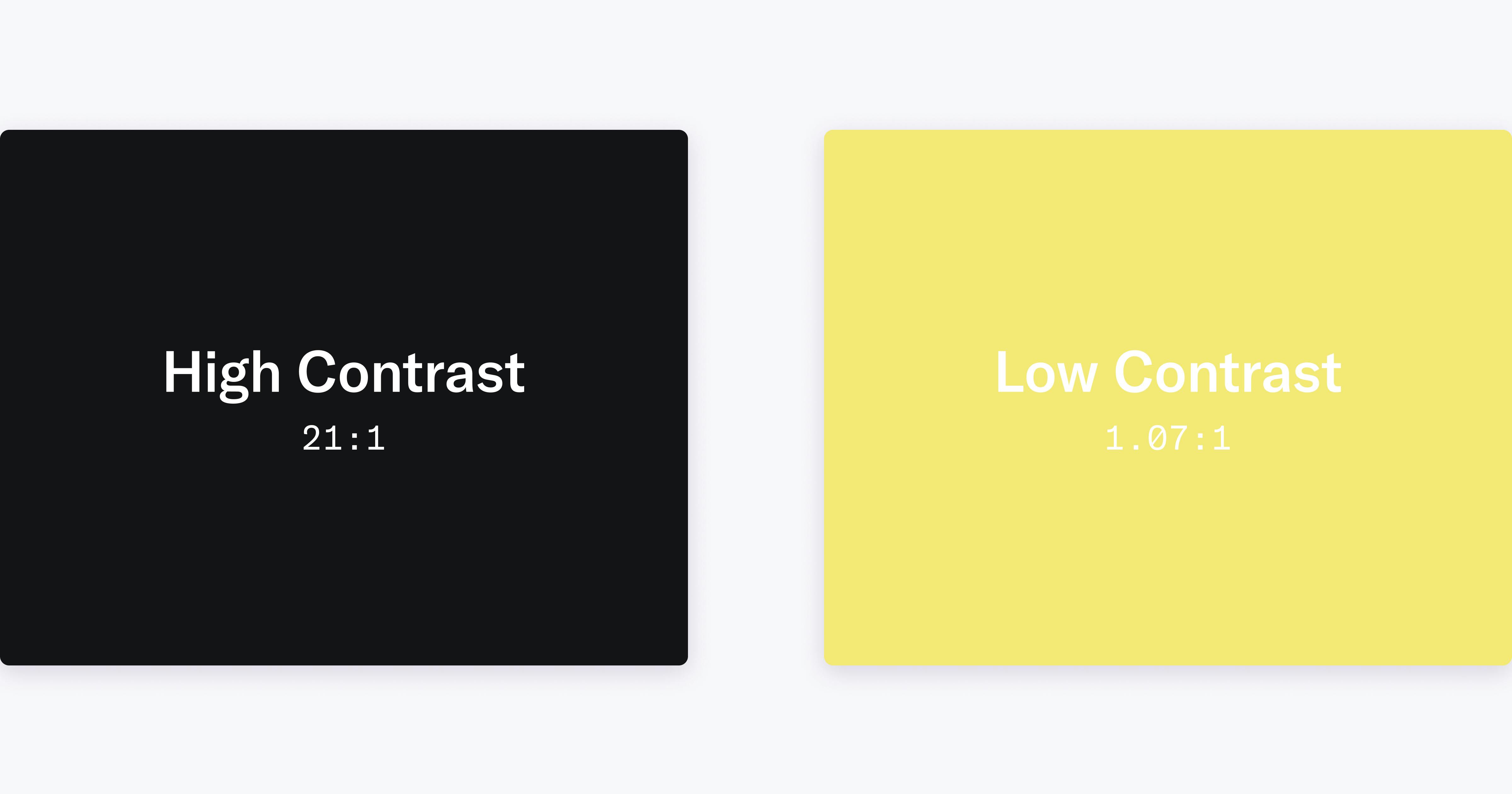
Example of Color Contrast and Effect on Readability
Why Color Contrast Matters
Color contrast refers to the difference in brightness between text (foreground) and its background. High contrast ensures that text stands out clearly, making it easier for all users (especially those with visual impairments) to read. Poor contrast, on the other hand, causes eye strain and can make your content inaccessible.
According to the Web Content Accessibility Guidelines (WCAG), Regular text should have a contrast ratio of at least 4.5:1, while large text should meet 3:1. These standards help ensure that users with low vision or color blindness can still perceive content clearly.
Tips for Improving Readability
- Use contrast checkers
- Tools like Adobe Color or WebAIM’s Contrast Checker allow you to test color combinations and ensure they meet WCAG standards.
- Avoid color-only distinctions
- Don’t rely on color alone to communicate meaning—use icons, patterns, or text labels for clarity.
- Test in different environments
- View your design in both bright and dark modes to ensure readability in various real-world conditions.
- Stick to simple combinations
- Dark text on a light background or vice versa usually works best for extended reading.
Balancing Aesthetics and Accessibility
Good design doesn’t have to sacrifice style for accessibility. With thoughtful color choices, you can create an appealing aesthetic that still supports all users. Try experimenting with subtle contrast variations within the acceptable range to add visual interest while maintaining readability for your text.
Call to Action
Next time you design a webpage, poster, or slide deck, test your color contrast before publishing. Share your favorite color contrast tools or tips in the comments and challenge yourself to make every project more accessible for all readers!

Thanks for this article! Sometimes I find myself squinting at webpages – it was probably because of the low color contrast! I found this website to assess color contrast ratios: https://webaim.org/resources/contrastchecker/. I’m glad ratio tools exist, so I can experiment with making colorful pages and ensure they’re accessible! For instance, I notice my workplace likes using white on blue or yellow on blue. Running these colors through the contrast checker shows they have good contrast!
What are some font and background colors you, or other organizations you’ve worked with, like to use?
This was such an interesting read! I think your tips for improving readability are especially helpful for everyone to consider, since I feel like oftentimes people just don’t realize that they have poor contrast, especially if they themselves aren’t visually impaired. The tools you mention (I personally really like Adobe Color for comparing text and background colors) are a great help for that and super easy to use. It doesn’t take long to find a high contrast design, but it makes a world of difference.
This is a great, pretty comprehensive but simple and clear overview of what color contrast is and easy tools to learn more and easily check and fix it. I love it! This is not just an accessibility issue, but an issue of good design- everyone is affected when contrast is really bad. I can tell that you understand this and I love how you address this in your post.
In your graphic at the top, I think there is a typo- it says “you”, where in your title it says “your”. My only other suggestion for this post would be to include a link to the pages for Adobe Color and WebAIM when you recommend those, so that readers can easily go to those tools and try them out.
Great topic and work!